#helluvaboss redesign
Explore tagged Tumblr posts
Text
Finally got some art to post! Here’s a redesign of Moxxie and Millie! I’ll share my thoughts below!

So honestly I think moxxie and Millie have pretty good designs! I think most of the imps are well designed, my only complaint is that they have way too similar shades of red and black and sometimes have too many little details.
So for my designs I tried to focus on shape language, I made moxxie rounder to show that he’s a more friendly and approachable and Millie more boxy to give a more clear idea that she’s the muscle of the group.
I used different shades of red just so it’s easier to read whos who’s who when the characters get clumped together (the black and red in the original designs sometimes makes it really hard to tell)
I gave Millie and more southern look to reflect her wrath roots, I don’t really like the goth scene look she has in the show. Also I took away the eyelashes (I’m sorry they just don’t fit her and she looks like she can fly away with each blink 😭) and gave her a few scars
Moxxie will still be from greed but I’m gonna remove the mafia plot from his story ( it’s doesn’t seem too important to the main plot anyways and we have enough daddy issues)
I’d imagine he just an odd imp who’s more timid and happens to have a knack for shooting.
People are probably not gonna like this but if ever rewrite helluva, I don’t think moxxie and Millie would be married at least not right away.
I would think hell doesn’t really do marriage considering it’s more of a Christian thing anyways. I think it would be a cute idea if they learned about marriage from the living world and thought it would be fun to do lol. Ill probably make a separate post for my ideas for hellborns and the hellscape but I’ll save that for another time
Sorry for the ramble but if you guys have thoughts or criticism feel free to comment or send any asks!
#helluva boss critical#helluva thoughts#tumblr ramble#redesigns#asks open#helluvaboss redesign#imps#moxxie and millie
99 notes
·
View notes
Text
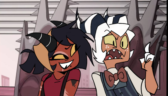
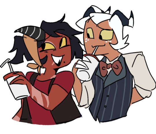
Some screenshot redraws of the mnms! I really wish they gave moxie more blue, i could barely tell he had any before hand. Also it just works very well with his personality
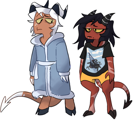
Honest to god think moxie would be the type to have extravagant robes and then just wear like heart boxers underneath. Millie would just rock graphic tees like the rest of us lmfao .
#mnms#moxxie Millie#moxxie x millie#helluva fanart#millie helluva boss#helluvaboss#hellaverse#hazbin hotel redesign#hazbin hotel#helluva boss redesign#helluva boss critical#I guess critical#millie knolastname#moxxie knolastname#Moxxie hb
126 notes
·
View notes
Text

Fizz for the soul (sorta redes sorta just in my style idk)
#hazbin#hazbin hotel#fizz#fizzarolli#helluvaverse#helluvaboss#helluva fanart#fizzarolli fanart#fizzmodeus#hazbin redesign
43 notes
·
View notes
Text


Mammon redesign
#my art#hazbin hotel#hazbinhotel#digtial artist#digtial art#demon#Helluva boss#HelluvaBoss#Mammon#helluva boss Mammon#helluva Mamon#Fanart#Art#redesign
27 notes
·
View notes
Text

Helluva boss redesign part 1/?. Because of the last episode, i wanted to make millie a lot more metal at first but i changed my mind and made her like this. I also gave loona this tacky haircut and moxxie a more violent expression because badass moxxie is underrated. When i was designing blitzo, i didnt know if i should give him the whore loom or the daddy look so i just gave him a fishnet top because of my poor designing skills lol.
#hellaverse#my art#my fanart#digital art#art#doodle#fanart#helluva blitzo#helluva boss#helluva boss blitzo#helluva boss blitz#helluvaverse#helluva fanart#helluvaboss#helluva boss millie#helluva boss fanart#helluva boss moxxie#helluva boss loona#redesign#helluva boss redesign#blitzo#moxxie#helluva millie#helluva moxxie#helluva loona
16 notes
·
View notes
Text
Guys sorry, I am not immune to Hazbin/Helluva propaganda. I am also not immune to criticizing the designs and character motivations.
So! Let’s start with one of the most redesigned characters in the show: Beelzebub^^
So, sorta hot take, I really like the idea behind Beelzebub in the show. Ik "boo tomato tomato," but hear me out. I like how she is meant represent the hellhounds she rules over (ik she actually is a reference to Jay Jay, but let me have this connection PLEASE). However, the source material is very bug-like and compact.
The HB Beelzebub is NOT that bug like. Or compact.
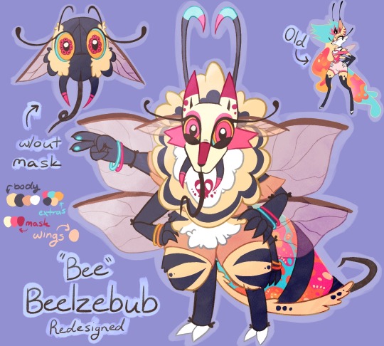
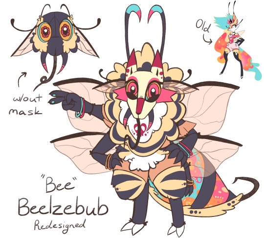
With this redesign, I decided to pick all the stuff I liked about the og, and what I wanted to see more of. I kept her colors and general vibe but made her more built like a bumble bee with more inspo from the fly Beelzebub.
This is what I got.
Progress doodles n stuff below cut (it's gonna be an essay, y'all know the drill):

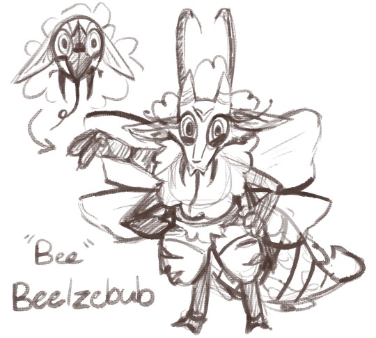
(She was much sharper in the sketch lol)
DESIGN EXPLANATION:
Anyways, I always imagined Beelzebub to be, y'know, more BEE like. The show did not give me that, so I did it myself. I made her wings bigger, gave her an actual bee tail and face (with the proboscis and stinger too), and more stripes and fluff. I also made her small and slightly chubby. Gotta hone the bumble bee.
I thought the hair made the original design too cluttered, but I wanted to keep the party colors. To compromise, I stuck all the goop in her tail. It sort of works like a firefly's abdomen and a lava lamp. I also nullified her cloths, so they would blend more with the body and help pop the neon colors in her eyes, antenna, and tail.
When she stands at her normal form, she is the smallest of the sins. But when she is in her "true" form (that I have not illustrated yet), she is the biggest of the sins. This is a reference to how gluttony starts small but gets really large over time, both mentally and physically.
As for additional details, I wanted to keep her "foxness". So in a brilliant brainstorm of ideas, I came up with the concept of "Masks". Basically, all the sins I'll redraw will have them. The masks are meant not only to represent their hellborn, but to represent how the sins pretend to be good things at first.
Stuff like "Rest a little more, it won't hurt" and "Be proud and don't care for what others say" are how they present on the surface, but if you continue those mindsets in a toxic way, it turns into sloth and pride and stuff instead of self-care and being proud of things.
For Bee specifically, it's "Have a little more, you deserve it!" and she has a hell-hound/fox mask. This also feeds into her personality change.
PERSONALITY CHANGES:
In the og, she's a party animal who cares for... moderation??? Yeah, I hate this about Helluva Boss. Why is it so hard to write *sshole/negligent people in power and why is it only Mammon who's allowed to be like this? Give me more morally dark grey powerful people!
That's where Bee is different for the redesign. She runs te lowest ring in hell and is in charge of hellhounds, the lowest species in hell. B/c of this, she is much more lenient compared to the higher ranked sins in hell, which is why she is often seen talking and hanging out with lower classes. (She gets slack for this from the other sins). She is also the only sin who has had open relations with lower class citizens all the way down to hellhounds. However, none of them last. Most of her relations outside of the sins are one-night stands and flings.
As for how she sorta sucks: she is still a party animal, yes, but she purposely chooses to be blind and ignore all the suffering that occurs at the parties. People have fun, but they overindulge, and as a result get sick, sad, and violent. However, Bee leaves the parties before they get this way. She does not want to see it. She is negligent. When she comes back to the party aftermaths, she quickly gets her workers to clean everything, so she does not have to discover anything gruesome and sad. She just wants to live, party, and see people "happy". (Sort of like Gatsby's parties minus the pining for a single woman who does not care for her).
... I wonder what would happen if that mental image she had shattered? I guess only the future will tell.
But anyway, if you have any questions or characters you recommend I design or redesign, feel free to ask lol.
I hope this made at least a little sense. Have a lovely day^^
#beelzebub is probably one of my favorite sins in the show aesthetically#but it's so cluttered and looked so painful to animate#also having her be stout and fluffy seemed so novel to me#no more skinny girls with thick thighs give me tiny girls with thick everything#hazbin hotel#hazbin art#helluva boss#helluva fanart#helluva beelzebub#helluva beelzebub redesign#redesign#character redesign#vivziepop#helluva redesign#helluvaboss#also if you don't like this please don't comment that#i don't need that negativity in my life this is just for fun#katiekatdragon27
60 notes
·
View notes
Text
I have something for you guys ….
here are my redesigns of the four known 7 deadly sins from the hellaverse! I’ll go in order explaining.

Here’s Lucifer — the adjustments I made were primarily to his hair and smaller features, such as giving him goat eyes, a snake themed cane, and pulling more classical and biblical inspiration forward. I love a lot of the artistic liberties in the Hellaverse designs but I do think that him being a curly-redhead is a pretty important thing that I hated to see left out of his design. I also gave him hooves and claws because I felt like he was a bit too human compared to the other sins, and wanted to make him stand out a bit more!
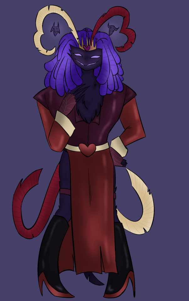
Next is Asmodeus! My main focus was to make it more evident which sin he represented — while I love Ozzie’s design, I felt like his color palette could be slightly more representing of the sin of lust, so I shifted toward warmer toned colors such as red and purple, while sacrificing the green and blue. I wanted to bring across more gender-fluidity since lust is something I think it is important to represent through various gendered lenses and so I went for the whole upper-half masculine lower-half feminine thing that you see here with a vest+button up and a long slit skirt! I also wanted to show more heart motifs that appear to be evident in ironically all of lust and its inhabitants besides Ozzie most of the time, and so I curved his tail and head feathers in a way that made heart shapes, and I placed Bull and Ram in a way where they’re more visible and stand out more so as their own little entities since it’s implied they’re separately sentient.

My girl Beelzebub! I LOVE her design, but I do feel like it leans heavier toward hellhound (and fox somewhat) and not enough toward her insect features, so I gave her Bee stripes as well as putting more emphasis and effort into her wings. I kept the multicolored lava lamp hair and belly but made an extra effort to highlight the gold in it to emphasize the honey/bee theme, while also placing this texture in other places such as her paws and inner-ears. I also gave her a honeycomb crown, and more loose-fitting flowy clothing to display her fun and laid-back nature, while referencing her bee themes again by adding a yellow gradient meant to mimic pollen that gets stuck on bees during their pollination process. I also gave her the funky bug eyes :) anddd sorry but I took away the mohawk, it just felt too cluttered for me to draw among other things.
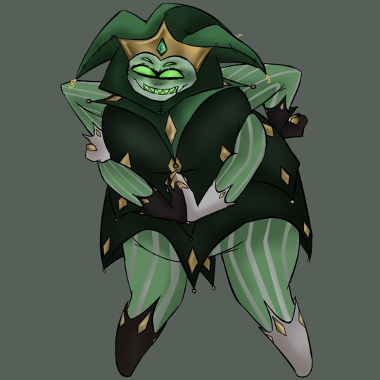
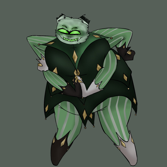
Here’s Mammon! I may be biased but I love his design so much already that it was difficult to change a whole lot. However, I did find things that I wanted to change. For one, you may notice there are hat and no-hat versions of Mammon here, and that’s because I wanted to display the broken imp-like horns I gave him. In biblical mythology, Mammon often disguised himself as someone who was poor or in need so that he would be able to garner profit from pity, and I think that there is no better way to represent that than ripping off his favorite little brand-baby. I edited a lot of the black in his color palette to be gold instead, as well as adding gold to the fingertips of his gloves as a reference to Midas’ touch. I gave him more of a spider-like appearance since according to a lot of the fandom his species is fairly ambiguous, and I made his shirt (or whatever you call that lol) a bit shorter and less cluttered because I often struggled with drawing it. I also attempted to adjust his proportions a bit as I feel like the designs for the fat characters in Helluva and Hazbin often struggle a bit with proportions and it feels important to me to better represent them.
That’s all I got, but I also created my own takes on the sins that haven’t been revealed yet, which may end up being one of my next posts! I’m doing my best to stay active in the art community and this media has given me some motivation and fuel. Any input is welcome as long as we stay positive ❤️
Reminder as well that my commissions are very open!
#bunneclair art#wlw artist#queer art#queer artist#art#commissions open#helluva boss#hazbin hotel#helluva boss fanart#hazbin hotel fanart#helluva boss redesign#hazbin hotel redesign#lucifer morningstar#hazbin lucifer#helluva boss mammon#helluva boss asmodeus#helluva boss beelzebub#hellaverse art#hellaverse fanart#hellaverse#helluvaboss sins#looking for commissions#character design#character redesign
36 notes
·
View notes
Text


My crimson redesign attempt I guess
#artwork#artists on tumblr#drawing#digital art#ibispaint art#character design#helluva boss art#helluvaboss#helluva boss crimson#helluva boss redesign
104 notes
·
View notes
Text


this is my second time drawing a different hair texture so any advice will be appreciated
but this is how i imagine millie will look if she had a proper disguise
129 notes
·
View notes
Text


Based on this decided draw Prim with some really cool redesign striker designs I saw including mine too and also adding original too HIBJBJJBBJ
Art and oc belongs to me aka @demon-frog
Redesigns belongs to
@lovesart23
@darknadaworld
@zakutari
@fatratbabyy
I love your strikers designs I hope you don’t mind me drawing them 👉👈
#my art#my oc#helluva boss oc#helluva boss striker#hb oc#helluva boss#angel oc#hb striker#reaper oc#redesign striker#helluva boss redesign#striker x oc#helluvaboss striker#helluva striker#striker helluva boss
18 notes
·
View notes
Text

Hii. So,i did a bit of a redesign of our queen,VEROSIKA.
I decided to start doing redesigns of HH and HB characters,the next one Might be Stolas or Blitzø!

12 notes
·
View notes
Text
bwahhhhh!!!
Bee has been digitaled now
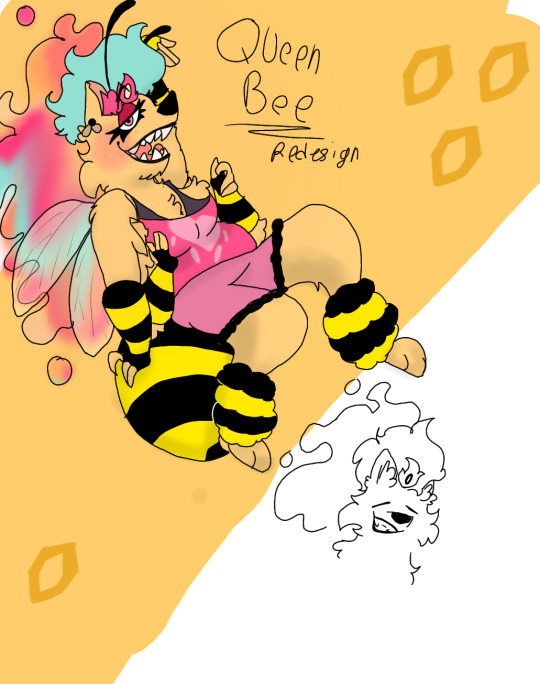
Yee
And Stolas!


I tried to feed into his astronomy thing that I wish appeared more.
So I made him fruitier
Somehow
#helluva blitzo#helluva boss fanart#helluva fanart#helluvaboss#helluva loona#helluva boss season 2#helluva fizzarolli#helluva boss#helluva redesign#helluva rewrite#hb fizzarolli#fizzaroli helluva boss#blitzo#helluva boss fizzarolli#helluva boss asmodeus#helluva boss critical#helluva boss review#helluva boss rewrite#helluva boss redesign
38 notes
·
View notes
Text
I put Verosika in her Human form's outfit and gave her the hair as well

Originals


#verosika mayday#helluva redesign#helluvaboss#demon#helluva boss verosika#verosika fanart#outfit swap#succubi#helluvaboss fanart
40 notes
·
View notes
Text


Redesign explanation:
- The most obvious one, I gave him a more chicken like head.
- I based him off of a cockatrice while trying to maintain his look from the show.
- Since he's a rooster I tried to use more outstanding colours to refer to male birds who also try to show off by having as much colours in their feathers as possible.
- I also got rid of the two other heads of his, instead I turned those into horns and hoofs to refer to the two other animals.
- For the outfit I didn't have much ideas so I gave him a suit and a hat with feathers and a little heart decoration.
And keep in mind that this redesign is just for fun and NOT for to make fun of the character!
I just put this here because people have a tendency to go wild regarding redesigns and the like in this fandom!
And I'm in no need nor here for that!
#art#helluva fanart#helluvaboss#helluvabossfanart#vivziepop#vivzieverse#vivziepop helluva boss#spindlehorse toons#redesign
48 notes
·
View notes
Text


Asmodeus/ozzie redesign
#my art#hazbin hotel#hazbinhotel#digtial artist#digtial art#demon#Helluva boss#HelluvaBoss#Asmodeus#helluva boss asmodeus#helluva asmodeus#helluva boss ozzie#ozzie#Fanart#Art#redesign
21 notes
·
View notes
Text
Should I do helluva boss redesigns (imp+the sins)
#lgbtq#lgbtqiia+#gay#helluva fanart#helluva boss#helluvaboss#helluva blitzo#helluva stolas#helluva loona#helluva boss redesign#helluva boss rewrite
8 notes
·
View notes